Vectorize my logo + font

  • Status: Closed
  • Prize: $50
  • Entries Received: 63
  • Winner: inihisyam

Contest Brief

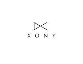
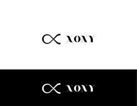
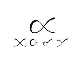
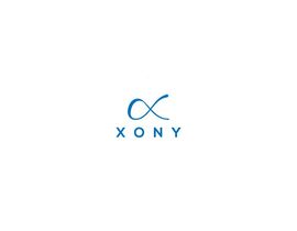
Hello everyone! I am starting a new business, and I already decided the name and designed the logo. I have a sketch of the logo; I need someone to make it professional: vectorials, blueprints.. something you can easily do with Illustrator or Sketch. I am a designer, but don't have time now.

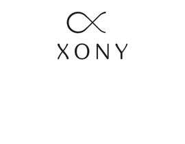
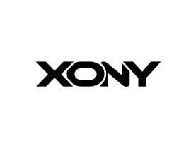
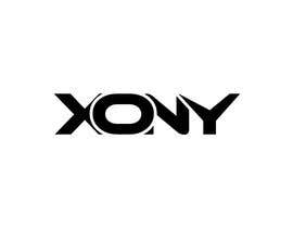
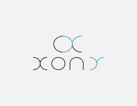
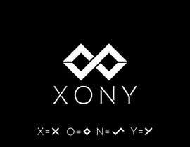
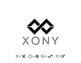
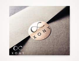
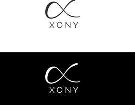
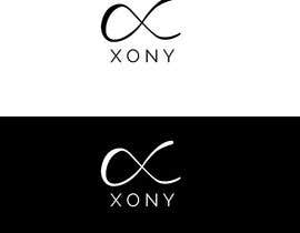
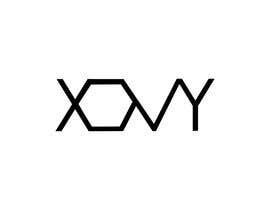
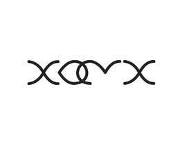
I am going to attach the idea: it's the overlapping of four letters "X + O + N + Y".

As regards the font for the name "XONY": I want it to be minimal, very clean.
Examples:
1) http://cdn.waaterkant.com/wp-content/uploads/2015/03/Maria-Ustinova-B-ANNET-18.png
2) https://fiverr-res.cloudinary.com/images/t_main1,q_auto,f_auto/gigs/110928855/original/1cbde60d00a25158798f8b9b12c19264516f266d/do-minimalist-logo-design.jpg
3) https://99designs-blog.imgix.net/wp-content/uploads/2017/05/attachment_83680443-e1493840411341.png?auto=format&q=60&fit=max&w=930


thank you all <3

Recommended Skills

Employer Feedback

“Super, amazing professionist”

Profile image peppegiuseppe, Italy.

Top entries from this contest

View More Entries

Public Clarification Board

  • GreentriK6789
    GreentriK6789
    • 4 years ago

    #33 #30 #28 please check and feedback thank you ;)

    • 4 years ago
  • forever555
    forever555
    • 4 years ago

    please check #35

    • 4 years ago
  • JubairZidan99
    JubairZidan99
    • 4 years ago

    #34 check it out sir .

    • 4 years ago
  • forever555
    forever555
    • 4 years ago

    please check #14

    • 4 years ago
  • peppegiuseppe
    Contest Holder
    • 4 years ago

    best font for now, #3
    but we can do better! minimalism is the key

    • 4 years ago
  • peppegiuseppe
    Contest Holder
    • 4 years ago

    for now, #1 and #4 are my favorite. I like how they did the left side. It's like in movement and minimal. The problem is that the right side should be symmetric with the left. Like if they are at the mirror. except for the fact that the right side should be open.

    • 4 years ago
  • peppegiuseppe
    Contest Holder
    • 4 years ago

    it should be symmetric. Everything symmetric, it was made free hands, this is why it seems unbalanced. I like the 1st entry, very minimal, but we can still improve the right side. It should be "curvy".

    • 4 years ago

Show more comments

How to get started with contests

  • Post your contest

    Post Your Contest Quick and easy

  • Get tons of entries

    Get Tons of Entries From around the world

  • Award the best entry

    Award the best entry Download the files - Easy!

Post a Contest Now or Join us Today!