Improve this logo mockup for a web design/digital marketing business

  • Status: Closed
  • Prize: $65
  • Entries Received: 62
  • Winner: mhkhan4500

Contest Brief

Hi all, I'm looking for someone to design my new logo based on some pretty specific instructions. There shouldn't be too much variance here so whoever gets closest to my vision will win this.

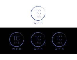
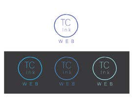
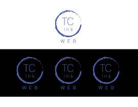
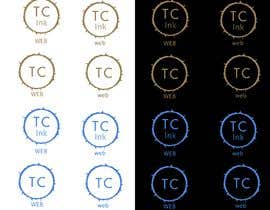
- A gold/brown "fuzzy/solar" (think the sun) circle (use this colour #9b8052 as a guide) OR Try BLUE (Pay attention to Q.JPG which I've uploaded)
- The letters "TC" (uppercase) within the circle. Use a clean, thin, modern font. (Use some letter spacing like the mockup)
- I also will want an example with and without the word "Ink" below the TC
- The word "WEB" below the circle (would like to examples using lower and uppercase)

- I've included a quick mockup I did which you can use as a starting point
- I've also included an image that I want the "fuzzy/solar" circle effect based upon. Ignore all the shattering and lines, we're focuses here on the text around the circle.

PLEASE DO NOT submit your design on an abnormal background i.e. business card, wall etc. Your submission will be rejected.

Use only a plain white background.

Thanks and good luck!

Recommended Skills

Employer Feedback

“Worked hard to produce numerous logo designs and got a winning result.”

Profile image TCInk, Australia.

Top entries from this contest

View More Entries

Public Clarification Board

  • mhkhan4500
    mhkhan4500
    • 5 years ago

    Thank You

    • 5 years ago
  • mhkhan4500
    mhkhan4500
    • 5 years ago

    Hope you like them

    • 5 years ago
  • mhkhan4500
    mhkhan4500
    • 5 years ago

    Check my enter

    • 5 years ago
  • mhkhan4500
    mhkhan4500
    • 5 years ago

    Hello

    • 5 years ago
  • mhkhan4500
    mhkhan4500
    • 5 years ago

    Check my enter

    • 5 years ago
  • ajimroman
    ajimroman
    • 5 years ago

    Check my enter#84

    • 5 years ago
  • mhkhan4500
    mhkhan4500
    • 5 years ago

    Check my enter

    • 5 years ago
  • mhkhan4500
    mhkhan4500
    • 5 years ago

    Hi

    • 5 years ago
  • TCInk
    Contest Holder
    • 5 years ago

    Hi all,
    I feel most are missing the mark here in some way, here is some general feedback:
    - I'd like quite a thin font to be used. Please no "techno" style fonts.
    - Please only use 1 colour for the logo
    - I'd like to see some examples in blue as well (ideally a blue that works on both black and white, so you might want to submit something like entry #2)
    - Try some letter spacing like I've used in the mockup
    - The circle sun/solar effect should be subtle, yet clear enough to notice that there is an effect.

    The best submission so far is #36

    I will update the brief with an additional mockup.

    Cheers

    • 5 years ago
  • Afsananodi
    Afsananodi
    • 5 years ago

    Dear sir please chack my entry #30 #31 #32 #33 #34, if you want to any change please tell me.I can do any change just for your hapines.

    • 5 years ago
  • ElvisB6
    ElvisB6
    • 5 years ago

    Please check #26

    • 5 years ago
  • Mdrabbehasan
    Mdrabbehasan
    • 5 years ago

    HI sir ! I hope you're like to my job, please check my Entry #24 #25

    • 5 years ago

Show more comments

How to get started with contests

  • Post your contest

    Post Your Contest Quick and easy

  • Get tons of entries

    Get Tons of Entries From around the world

  • Award the best entry

    Award the best entry Download the files - Easy!

Post a Contest Now or Join us Today!