Fine tuning logo

  • Status: Closed
  • Prize: $20
  • Entries Received: 65
  • Winner: Sohannishu

Contest Brief

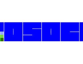
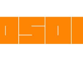
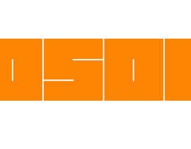
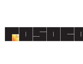
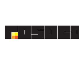
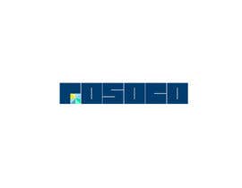
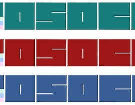
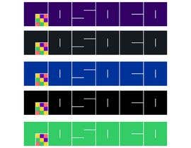
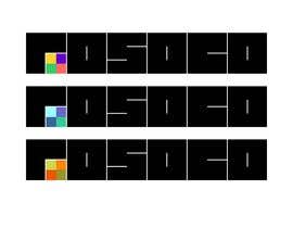
Please construct different variants of the attached logo.
We want the design to stay the way it is, but are interested in seeing how different colors changes the logo appeal.

1. Change / use different colors for the company name = rosoco
2. Use different colors in the color grid below the r in rosoco.
3. The color grid can be constructed using 4, 6 or 9 fields.
4. Work to find the best balanced design.

We are looking for a logo with the best color balance.

The wining entry needs to be delivered in jpeg, png, pdf and eps formats

Recommended Skills

Employer Feedback

“Very competent and professional work. Good communication skills.”

Profile image shooo71, Sweden.

Top entries from this contest

View More Entries

Public Clarification Board

  • stebo192
    stebo192
    • 6 years ago

    #56 : please zoom in the image.

    • 6 years ago
  • stebo192
    stebo192
    • 6 years ago

    #55 : please zoom in the image.

    • 6 years ago
  • stebo192
    stebo192
    • 6 years ago

    #54 : please zoom in the image.

    • 6 years ago
  • Rainbowrise
    Rainbowrise
    • 6 years ago

    please check the logo #40 and send me feedback.

    • 6 years ago
  • Riponprem75
    Riponprem75
    • 6 years ago

    please check myEntry #38 #39

    • 6 years ago
  • MdAbdulMozid
    MdAbdulMozid
    • 6 years ago

    please check myEntry #35

    • 6 years ago
  • shooo71
    Contest Holder
    • 6 years ago

    Hi everyone, thank you for all your entries so far. Some really interesting stuff. We would like to clarify a couple of points at this stage. Please try to keep to the same dimensions as the example we sent. That is the spacing between the letters should be as shown. Also keep them the same shape, no tapering. We would like to see some designs with different number of colored boxes. At this stage we have only seen examples with 9, lets see what 4 or 6 looks like. Also please add a white line around the colored area adjacent to the edge of the first letter R. The company Rosoco is a holding company for various businesses, so it should have a corporate feel but something that stands out.

    • 6 years ago
  • sujithnlrmail
    sujithnlrmail
    • 6 years ago

    Dear contest holder, please check my entries #8 #9 and #10 (every entry has two variations, i mean two images). For any suggestions and modifications, feel free to message me. Thank you.

    • 6 years ago
  • ElevateDigital
    ElevateDigital
    • 6 years ago

    Hey guys, What sort of company is it? Might help with the colour palette :)

    • 6 years ago

Show more comments

How to get started with contests

  • Post your contest

    Post Your Contest Quick and easy

  • Get tons of entries

    Get Tons of Entries From around the world

  • Award the best entry

    Award the best entry Download the files - Easy!

Post a Contest Now or Join us Today!