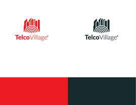
Design a Logo for TelcoVillage
- Status: Closed
- Prize: $500
- Entries Received: 12
- Winner: Pootnik

Contest Brief
Design a new Logo for TelcoVillage
• Combined version Logo with Text "TelcoVillage"
• Stand alone version Logo without Text
• Square Version for Mobile APPs
• Version for Business Cards
• 1 Bit Version (2-Colours Black and White e.g. FAX or Stamp)
Preferred Colours are Red, White, Black (Alone or in combination),
but feel free to use others if you think they might fit your design better.
The Logo must be designed as a Vector, but samples can be submitted as pixel versions.
I am anxious to see your proposals :) Good Luck !
Attached is the existing Logo from 2006, but do not get inspired from it !
Recommended Skills
Employer Feedback
“Pootnik is a talented designer that can visualise the customer's ideas into graphical designs that are very professional and beautiful. ”
![]() CKO1971, Germany.
CKO1971, Germany.
Public Clarification Board
-

daebby
- 7 years ago
Telco Urban?
- 7 years ago
-

Contest Holder - 7 years ago
Telco City
- 7 years ago
-
Contest Holder - 7 years ago
https://www.freelancer.com/contest/poll-ODYzMzczOjE=
- 7 years ago
View 8 more messages
-

bujarluboci
- 7 years ago
"full business logo" that really is "full" try that logo in smaller size and lets see if we can see the "full story business logo" even though its not simple no matter how much you try to explain, becuase when you add buldings sorry but thats not simple that's huge in both terms realistic and in telecommunications term. also archiprint was meant to be used digitally and not on all kinds of branding surface like telecommunications.
have a nice day.- 7 years ago
-

Pootnik
- 7 years ago
Read ---> full business STORY. You have icon smart guy for preview on small scale. Tell same story. More literal than abstract, Chill out, doesn't matter if i win or not. Like i said this is logo from cooperation. Someone like bigger, someone smaller, beauty is in the eye of the observer.
- 7 years ago
-
Contest Holder - 7 years ago
No new comments about "Extensions" they will be deleted.
- 7 years ago
-

sameer9262
- 7 years ago
I am excited to see the winning Design !!!!!!!!!!!!
- 7 years ago
-

DanielDesign2810
- 7 years ago
Well... looks like I'm out of ideas. :/
Good luck to both CH and the participants and all the best out there!
Kind regards,
Daniel- 7 years ago
-
Contest Holder - 7 years ago
Thank you Daniel for your professional behaviour. I wish you all the best and good success with your next project. Cheers
- 7 years ago
-

won7
- 7 years ago
#extended
- 7 years ago
-

mahossainalamgir
- 7 years ago
Please up load few sample image.....
- 7 years ago
-
Contest Holder - 7 years ago
I won't explain the others, but as you can see, none of the Logos I mentioned is "Abstract"... or you do not know what the meaning of abstract is.
- 7 years ago
-
artworkstudionet
- 7 years ago
To use your own words: "if you have to explain them...." or "how many people would know that?"
Maserati doesn't produce tridents, forks and doesn't have anything to do with mythology or with the sea.
What has "to hear" to do with cars??
All those logos, as YOU explained, have a symbolic meaning, they are used in an abstract way. Check the definition of abstract to see who doesn't know.
That's why we need communication and feedback. Because many people, like you, lack a consistency of thinking.- 7 years ago
-

UnivDesigners
- 7 years ago
can you please provide feedback on #1152,don't just reject, please provide a feedback
- 7 years ago
-
MariaDesigne
- 7 years ago
Hello Pelase Check #1137 thanks
- 7 years ago
-

AlexCapp74
- 7 years ago
Entry #1135 please and thank you in advance for the consideration!
- 7 years ago
-
artworkstudionet
- 7 years ago
Please check Entry #1084 and Entry #1101
- 7 years ago
-
artworkstudionet
- 7 years ago
Another one, entry #1084
- 7 years ago
-
artworkstudionet
- 7 years ago
New entry #1068
- 7 years ago
-

dkanurag
- 7 years ago
Please up load few sample image.....
- 7 years ago
-
Contest Holder - 7 years ago
Hello, I am not the designer, you are. It is your creativity that I am expecting. If you want me to be creative and tell you what to do, then I won't be a good help. Surprise me with your concepts.
- 7 years ago
-
bujarluboci
- 7 years ago
I give up, because you don't seem to know what you like even for yourself. lets see what the winner has to offer and what was the "wow" factor that you were looking for all the time in the icon.
- 7 years ago
-
Contest Holder - 7 years ago
Hello Bujarluboci, thank you for your participation.
- 7 years ago
-

argan13
- 7 years ago
my logo meet the requirements of the brief, it is easy to integrate to an icon, and represented the telecommunications, but was rejected. :(
- 7 years ago
-
Contest Holder - 7 years ago
I see that you also wrote an explanation to your submission. If I need to read the explanation to understand what I see, then the task of the Logo is missed. The purpose is that the Logo speak by itself without further explanation. And, some little detail, if you don't mind, I will have to like the Logo as it will be representing my company, be written on my business cards... so is it bad if I reject a logo I don't like ? Please excuse me, but it is not sufficient to meet the brief description to win this contest.
- 7 years ago
-
mahossainalamgir
- 7 years ago
Please remove the following word: Design a new Logo for TelcoVillage
• Combined version Logo with Text "TelcoVillage" from the public clarification board.- 7 years ago
-
Contest Holder - 7 years ago
Why should I remove that? The LOGO should have 2 elements. The one element is the ICON, which does not contain letters or text and the second one is the "TelcoVillage" as Text.
- 7 years ago
-
Contest Holder - 7 years ago
There is a difference between LOGO and ICON. Please let me know if there is a misunderstanding.
- 7 years ago
-
dkanurag
- 7 years ago
sir u want telco village font style. not a icon
- 7 years ago
-
sameer9262
- 7 years ago
YES
- 7 years ago
-
Contest Holder - 7 years ago
It seems that the public clarifications provided are not read by everyone.
So I am adding them again:
• Do not copy the old Logo, we want a brand new Logo and NOT the old one reshaped
• Do not use Letters in the ICON itself. Especially do not create a logo of "T" and "V".
• Do not submit abstract ICONs
• Do not submit Icons that are not related to Telecommunications
• The "TelcoVillage" text is only supportive, it cannot be the ICON.
• Use the Colors Red, White and Black for the ICON
• The Icon must be fitting also as a APP Icon, so a squared Icon better.
Submissions that do not meet the above criterias, will be rejected without comments.- 7 years ago
-
dkanurag
- 7 years ago
ok sir samer9262 sir
- 7 years ago
-
Contest Holder - 7 years ago
Hello dkanurag, what do you mean by that ?
- 7 years ago
-
dkanurag
- 7 years ago
sir plz check my update entry
- 7 years ago
-
Contest Holder - 7 years ago
It seems that the public clarifications provided are not read by everyone.
So I am adding them again:
• Do not copy the old Logo, we want a brand new Logo and NOT the old one reshaped
• Do not use Letters in the ICON itself. Especially do not create a logo of "T" and "V".
• Do not submit abstract ICONs
• Do not submit Icons that are not related to Telecommunications
• The "TelcoVillage" text is only supportive, it cannot be the ICON.
• Use the Colors Red, White and Black for the ICON
• The Icon must be fitting also as a APP Icon, so a squared Icon better.
Submissions that do not meet the above criterias, will be rejected without comments.- 7 years ago
-

jaydevb
- 7 years ago
Same contents on https://www.truelancer.com/contest/design-a-logo-756. Is that genuine or fake ?
- 7 years ago
-
Contest Holder - 7 years ago
We also have sent an email to their support informing them.
- 7 years ago
-
DanielDesign2810
- 7 years ago
Knowing some members of the community, I'd sooner say that contest was posted on "truelancer" to complete this one.... -.-
Nearly done with 2 versions of my entry, I'll be posting within 2hrs once I finalize and showcase them.
Best regards,
Daniel- 7 years ago
-

artsdezine
- 7 years ago
Please Check #986 #987 #988 #989 #990 #991
- 7 years ago
-
Contest Holder - 7 years ago
It seems that the public clarifications provided are not read by everyone.
So I am adding them again:
• Do not copy the old Logo, we want a brand new Logo and NOT the old one reshaped
• Do not use Letters in the ICON itself. Especially do not create a logo of "T" and "V".
• Do not submit abstract ICONs
• Do not submit Icons that are not related to Telecommunications
• The "TelcoVillage" text is only supportive, it cannot be the ICON.
• Use the Colors Red, White and Black for the ICON
• The Icon must be fitting also as a APP Icon, so a squared Icon better.
Submissions that do not meet the above criterias, will be rejected without comments.
Thank you- 7 years ago
-

swdesignindia
- 7 years ago
Check #967 and #970
- 7 years ago
-

DesignTed
- 7 years ago
Check Entry #976
- 7 years ago
-
mahossainalamgir
- 7 years ago
Please remove the following word from the description/
- 7 years ago
-
jaydevb
- 7 years ago
please check #946
- 7 years ago
-
bujarluboci
- 7 years ago
Entry #925 t really makes the design in overall great because of its simplicity and the three icons all in one simple shape , please leave feedback, changes can be made based on your opinion.
Thank you- 7 years ago
-
DanielDesign2810
- 7 years ago
Dear contest holder,
seeing this one just now and will start working on it today (so kindly do not close on me early, as I'll surely come up with 1-2 or more versions within the deadline). Thanks in advance!
Best regards,
Daniel- 7 years ago
-
Contest Holder - 7 years ago
Dear Daniel, the contest will not close early. All the time will be use until the end. Thank you.
- 7 years ago
-
DanielDesign2810
- 7 years ago
Running behind schedule, however I will upload my first version about 11hrs from this post (as it's 11pm my time and time for me to get some sleep and a clear head, then I'll continue on) :)
Thank you for the reply and patience by the way!
BR,
Daniel- 7 years ago
-

designinjector
- 7 years ago
Plz check #901 #902 #903 #916 .Thanks
- 7 years ago
-
designinjector
- 7 years ago
Plz check #901 #902 #903 #916 .Thanks
- 7 years ago
How to get started with contests
-

Post Your Contest Quick and easy
-

Get Tons of Entries From around the world
-

Award the best entry Download the files - Easy!