Freelancer: dipayanzed
Share:
Report Entry

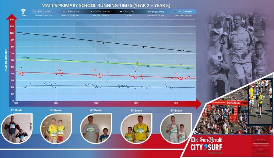
Picture Enhanced Version of Entry No. #16

OK Sir, Please Check The 3 Options With Picture. The Chart Section Have Been Kept Intact As Entry #16 , Only Changes Is Times Section (As Per Your Instruction). The Size Of The Chart, In Measurement, Is Also Same As Previous, Only The Default Canvas Size Is Changed And Optimized To Fit All The Pictures. In Actual File, All The Elements Are Very Clearly Visible And Can Be Printed In High Quality. I Kept The Main Focus In The Chart. The First 2 Options Is Blue And Gray Background Options Respectively. And 3rd One Is Same As First Except The Pic Of Race In Progress, Which I Made To Look Like A Water Mark Behind The Background. Please Check And Give You Valuable Feedback. Any Suggestion For Modifications Will Be Highly Appreciated. Thank You Sir.
Contest Entry #27 for                                                 Make my chart look good

Public Clarification Board

  • dipayanzed
    dipayanzed
    • 5 years ago

    OK Sir, Thanks For Your Feedback.. Actually I Have Tried To Keep The Main Focus On The Chart, As It's The Primary, And In Actual Image It Will Show Bigger And Everything Is Clearly Visible. But Anyway... Yes I'll Try To Find A Way To Make That Image A Bit Larger. Thank You Sir.

    • 5 years ago
    1. dipayanzed
      dipayanzed
      • 5 years ago

      It May Work As Well. Actually I'm Experimenting A Bit. And As You'r Gonna Put It On Wall, It Must Look Artistic Rather Than Corporate. So, I'm Trying My Best To Provide You The Best Piece of Work. And Actually I Do Not Want To Put Any Big Background Behind The chart, As Thi Type of Background May Distract The Vision And Can Make The Visitor Off Target. As The chart Is Your Primary Subject. But Anyway. I'm Trying To Fit The All In AN Artistic Way

      • 5 years ago
    2. dipayanzed
      dipayanzed
      • 5 years ago

      Sir, Please Check Entry No. #30 Revised Version.

      • 5 years ago
  • SimonBondi
    Contest Holder
    • 5 years ago

    Hi Dipayan, I really like what you have done. I prefer the first version of the three at this stage, but the other two are very good, too. Please remove the cup symbol and "Times" and re-centre the labels to use up the extra space. Is there any way that you can incorporate the larger image of the finishing photo? The background showing the beach, the crowds and the headland etc is a pity to not show (either in full colour or faded as a background) Even if the dimensions of the overall picture had to be changed again, that would be ok. thanks for your work on this, you are the clear leader.

    • 5 years ago
    1. dipayanzed
      dipayanzed
      • 5 years ago

      Sir, I'm Working On This And Will Surely Find A Way To Modify It In A Way That Make That Image Larger.. Thank You Sir

      • 5 years ago
  • dipayanzed
    dipayanzed
    • 5 years ago

    I Use The Shape Of The Images For Each Year As Water Droplets, As The Droplet Indicates Growing Up With Time.

    • 5 years ago

Show more comments Processing...